I made three content assets for Proper Good to show how I work: find the gap first, then make the thing that fills it.
This is spec work. Proper Good did not hire me, pay me or approve any of it. I received a couple of their soups, liked them, and wanted to show how I'd approach their content.
I picked this brand on purpose. It's a food brand started by a brother and sister who had the same problem I've had for 20 years of healthcare shifts. There was no time to cook and the fast options weren't good.
So I treated it like a real client. I researched first, wrote the strategy second and made the visuals last.
The brand in one minute
Proper Good sells fully cooked soup, pasta and oat meals in shelf-stable pouches. You heat one and eat it. The meals are in Target, Walmart and other grocers, and the site shows a 4.8 out of 5 rating across about 28,000 reviews as of November 2026.
The founders are Chris and Jen, a brother and sister. Their story page says they love eating well but don't have time to cook from scratch. Their choices were expensive healthy takeout or convenience food that wasn't good for them, so they made a third option.
They're also funny. The brand slogan is "Be Silly. Be Honest. Be Good." When they pitched on Shark Tank in 2021, they did it dressed as 18th-century British aristocrats, powdered wigs included.
What I noticed
The homepage sells well, but it leaves three things unsaid:
The founders are hidden. The story sits behind a footer link. The homepage never shows who makes the food.
No payoff moment. Lots of pouches. No steaming bowl, and no picture of how fast it’s ready to eat.
"Clean" is claimed, not shown. Reviews say the ingredients are simple. The page never shows them.
One more thing stood out. The slogan says silly, but most of the homepage copy is offers and discounts. The personality is there in the founders. It just isn't on the page.
The strategy
I pictured myself as a shopper, holding a pouch in the grocery aisle with three questions. Who made this?, Is it really ready in 90 seconds? and What’s in it?
So I made one asset for each question, ready for their social media and website. Chris and Jen can’t stand in every aisle to introduce themselves, so their content should do it for them.
The message across all three is simple. Real people made this, it’s ready in 90 seconds, and you can name every ingredient.
The founder story holds it together. That way the brand gets a human voice in just one post.
Asset 1: Our Story. Instagram Reel. Answers "who made this?"
A soup pouch wearing a small white powdered wig and a ruffled collar, like an 18th-century aristocrat. It's a nod to the costumes Chris and Jen wore on Shark Tank and to the line on their story page about loving ridiculous outfits.
I put the wig on the pouch and left the founders out of the picture. I didn't want to generate real people's faces, and the pouch in a wig is funnier anyway.
The copy tells their story in a few short lines: two siblings, no time to cook, bad options, so they made a better one. It's the silly side of the slogan, put where a customer can see it.
Asset 2: 90 Seconds. Zero Cooking.Instagram Story. Answers "how fast is it?"
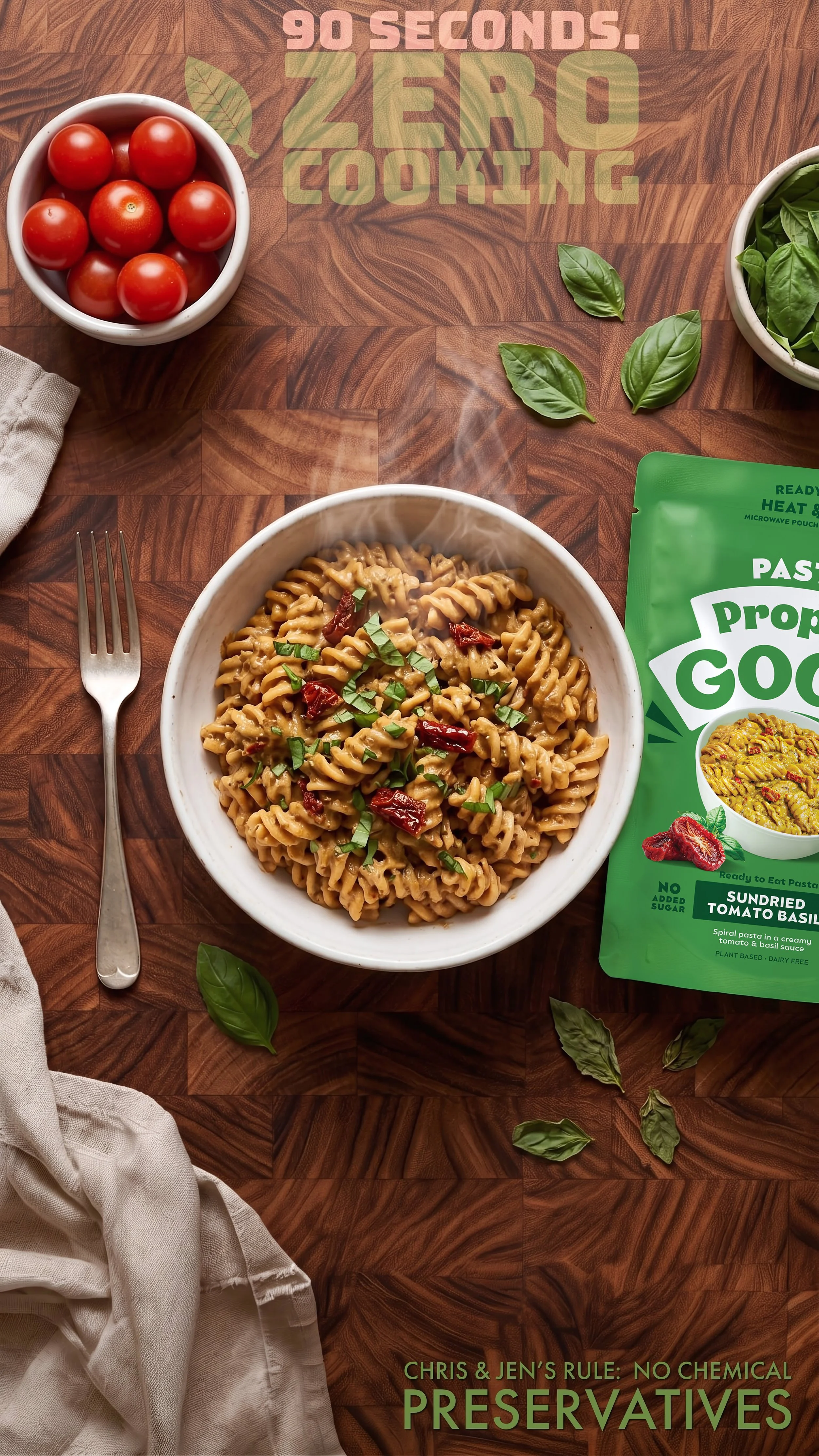
This one features the Sundried Tomato Basil. The top line reads "90 seconds. Zero cooking." The bottom carries Chris and Jen's promise: no chemicals, no preservatives.
The site shows the pouch but not the payoff. This asset gives the speed in four words at the top, where the eye lands first. The promise at the bottom removes the worry that fast food from a pouch must be full of things you can't pronounce.
I put the founders' names on the promise for a reason. A claim from "the brand" is easy to scroll past. A promise from two named people is harder to doubt.
Asset 3: What's in the Pouch. Static hero image. Answers "what's in it?"
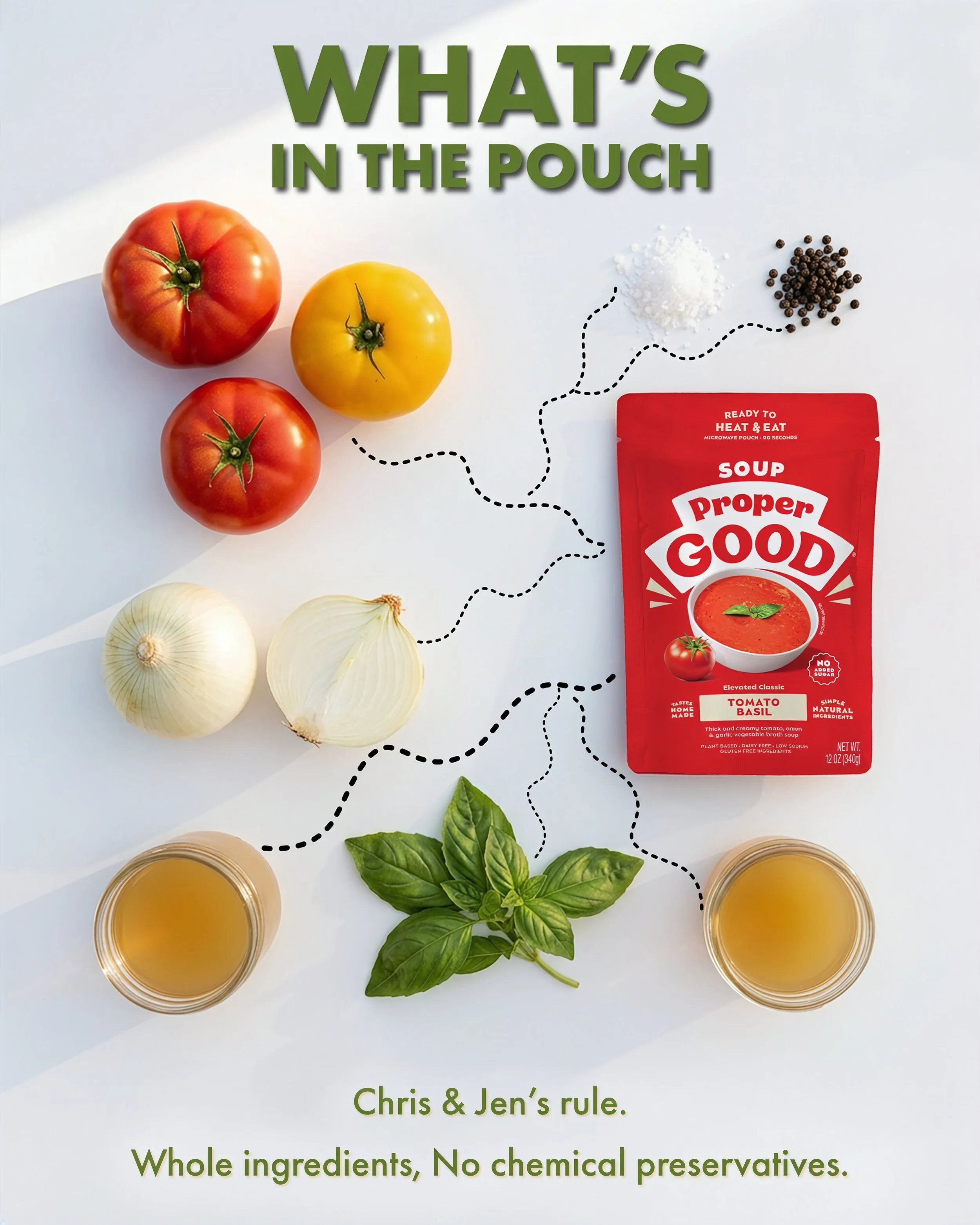
The pouch sits on the right. Around it are the ingredients: tomatoes, onion, salt, pepper, vegetable broth and basil. A dotted line runs from each one to a road, and the road leads to the pouch.
The point is that you can follow every ingredient from the counter to the meal. Whole ingredients, no chemicals, no preservatives.
I chose a road because it gives the eye a path. You read the ingredients one at a time and finish on the product. An ingredient list on the back of a pouch asks you to read. This one only asks you to look.
How I made it
I worked in this order: research, gaps, strategy, then visuals. The tools came last.
Adobe Suite Photoshop, Express and Firefly
My own photography AI tools scramble the words on packaging.
I used AI to help with research and drafting. The read on the brand, the choices and the final calls are mine.
Work with me
If you're at Proper Good, I'd love to hear what you think. If you're hiring for a content or creative strategy role, this is how I'd approach your brand too. And if you run a small business and want content with a reason behind it.
